Screen sizes in Build and new skills
Preview your site at a phone's size, draw a logo, write copy by Paralect's rules, and updates follow their files when they move.
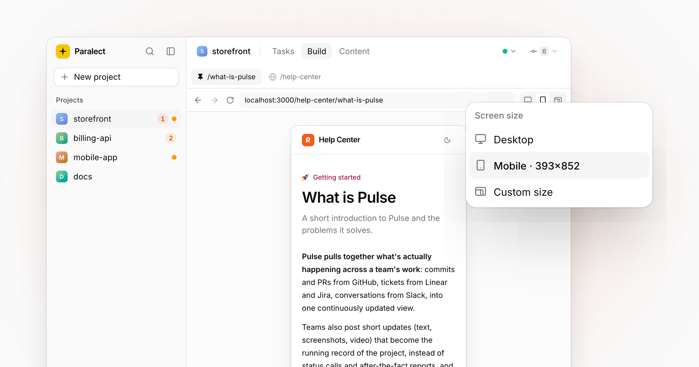
Screen sizes in Build
The address bar in Build has a screen-size switch: Desktop, Mobile at 393×852, or a Custom size you type in. The preview resizes in place, so you can check how a page reads on a phone without leaving the app. Popovers on the Build page now close when you click anywhere outside them, the preview included.
New skills on Run
- saas-logo draws a logo mark in the manner of Notion, Linear or Vercel, several concepts at once, and cuts the one you pick into transparent PNGs: the mark alone and the app-icon tile.
- Paralect Copywriter rewrites landing pages, articles and posts by Paralect's product marketing rules. It's suggested on Run, with a before-and-after preview.
Updates follow their files
Renaming or moving an update's file on disk no longer makes a second copy of the post: the feed follows the file to its new place.